Data Visualization
Need to create clear, appealing and approachable plots of your hard won data for your website, an internal company report or a published research paper or book? Collaborate with PhD|Advantage to create the effective data visualization you need.
Talk to our Business Development Team about your requirements.
Who Are We?
We have a group of highly experienced, PhD-educated statisticians and methodologists who can create stylish maps, data plots and other effective data visualizations that your company needs to communicate its research data clearly to your staff, clients or stackeholders.
Many of our collaborators choose to couple our Data Visualization services with our Quantitative Analysis and Qualitative Analysis services.
-
To attract and hold your target reader's attention, the graphics designed for your website or externally-published article or book need to look appealing and approachable at first glance. Work with PhD|Advantage and we can ensure that your business can present its data to non-technical audiences without confusion.
-
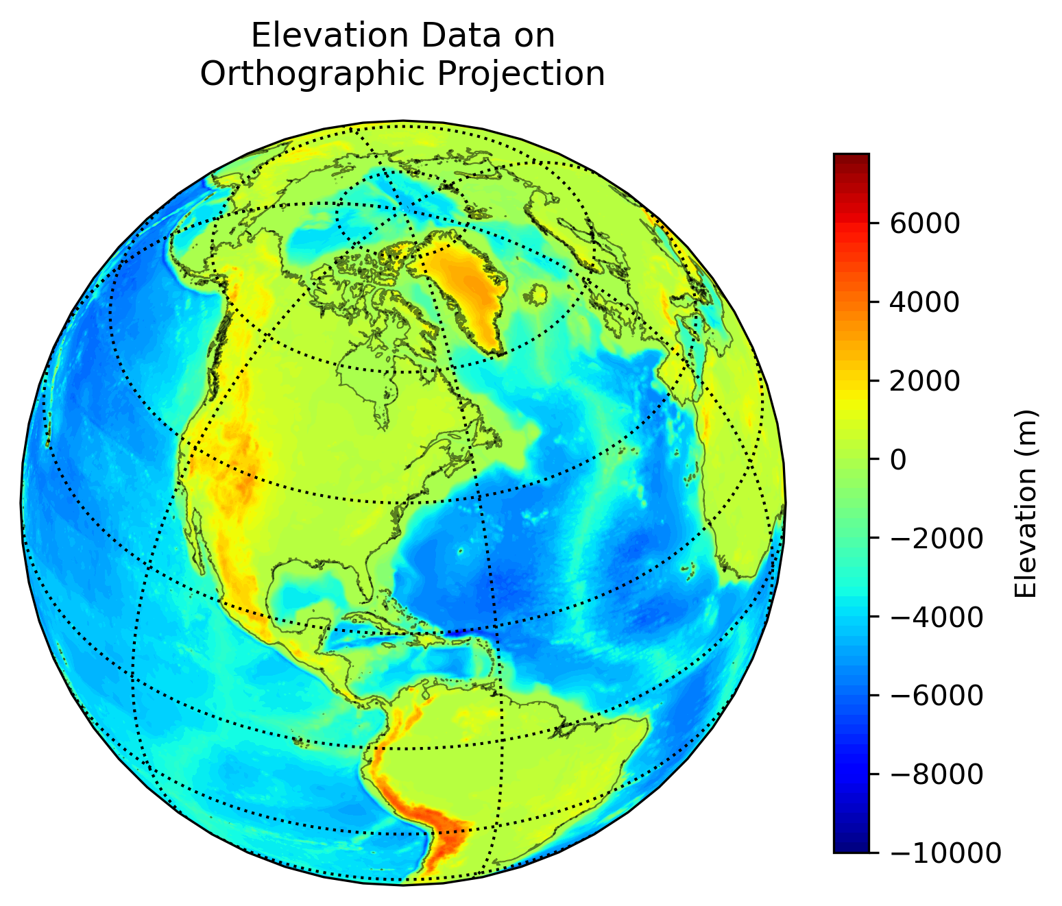
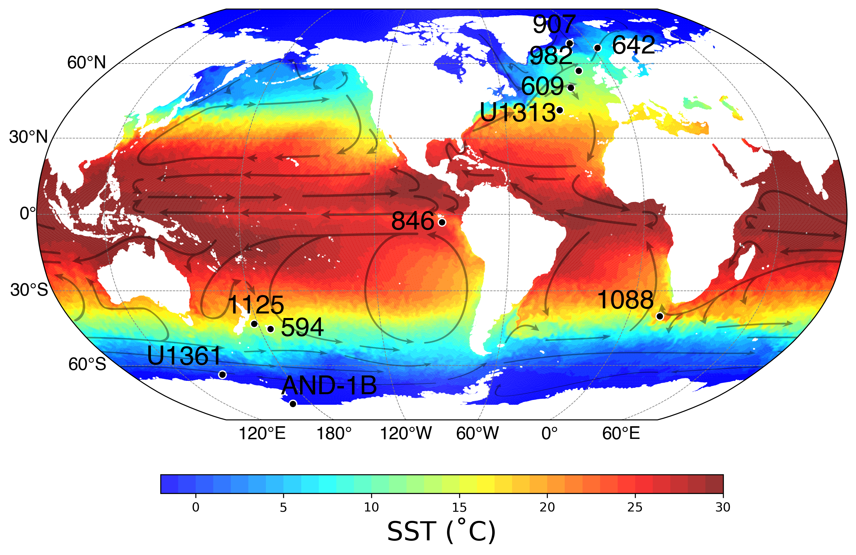
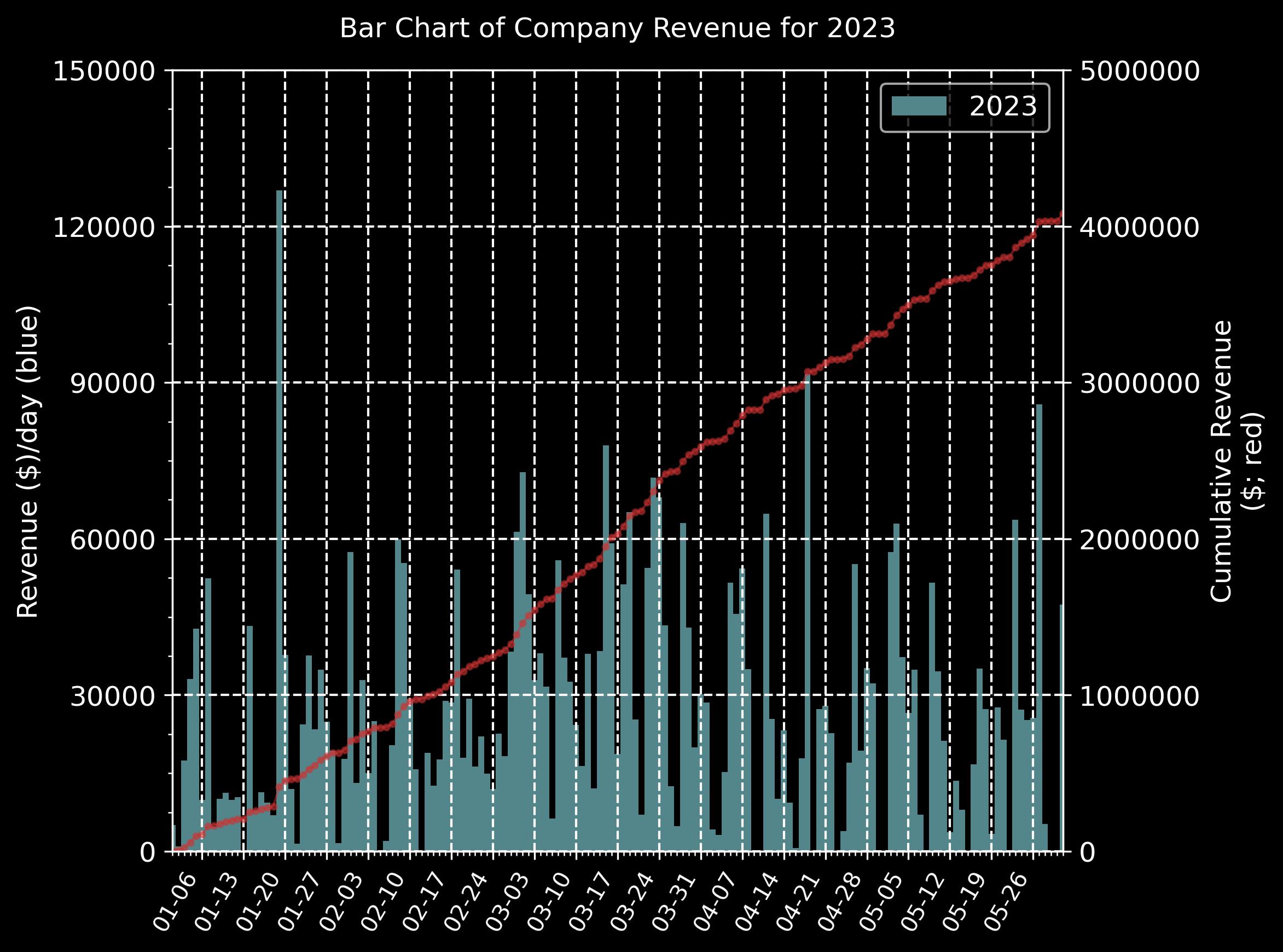
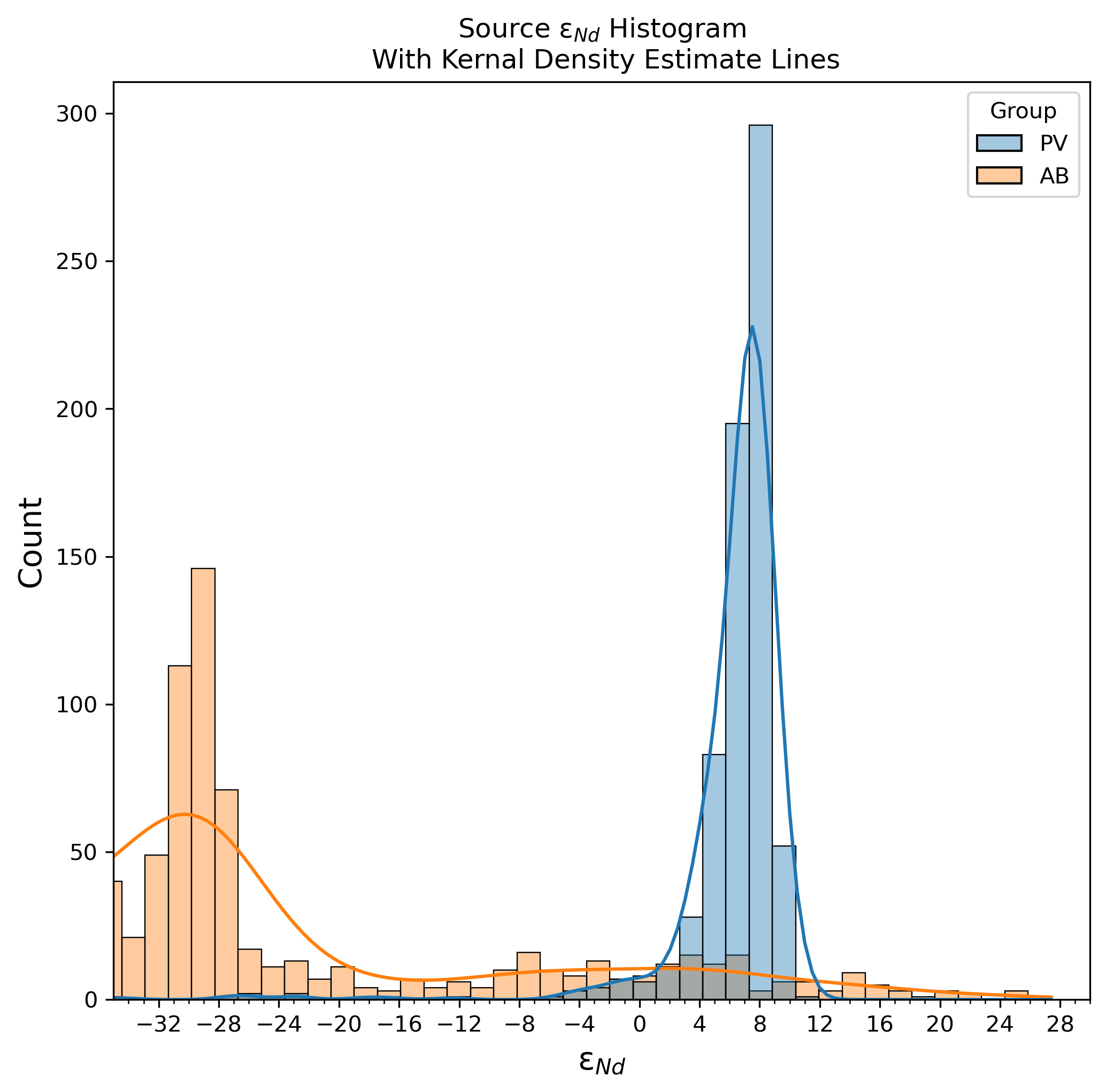
We can create a wide range of bespoke 2D and 3D maps and graphs, including:
-
cross-plots
-
cartesian graphs
-
scatter plots
-
box (violin) plots
-
line plots
-
contour plots
-
pie charts
-
vector plots
-
bar charts
-
probability/kernel density plots
-
histograms
-
geospatial data plots using the full range of geographic and projected coordinate systems
-
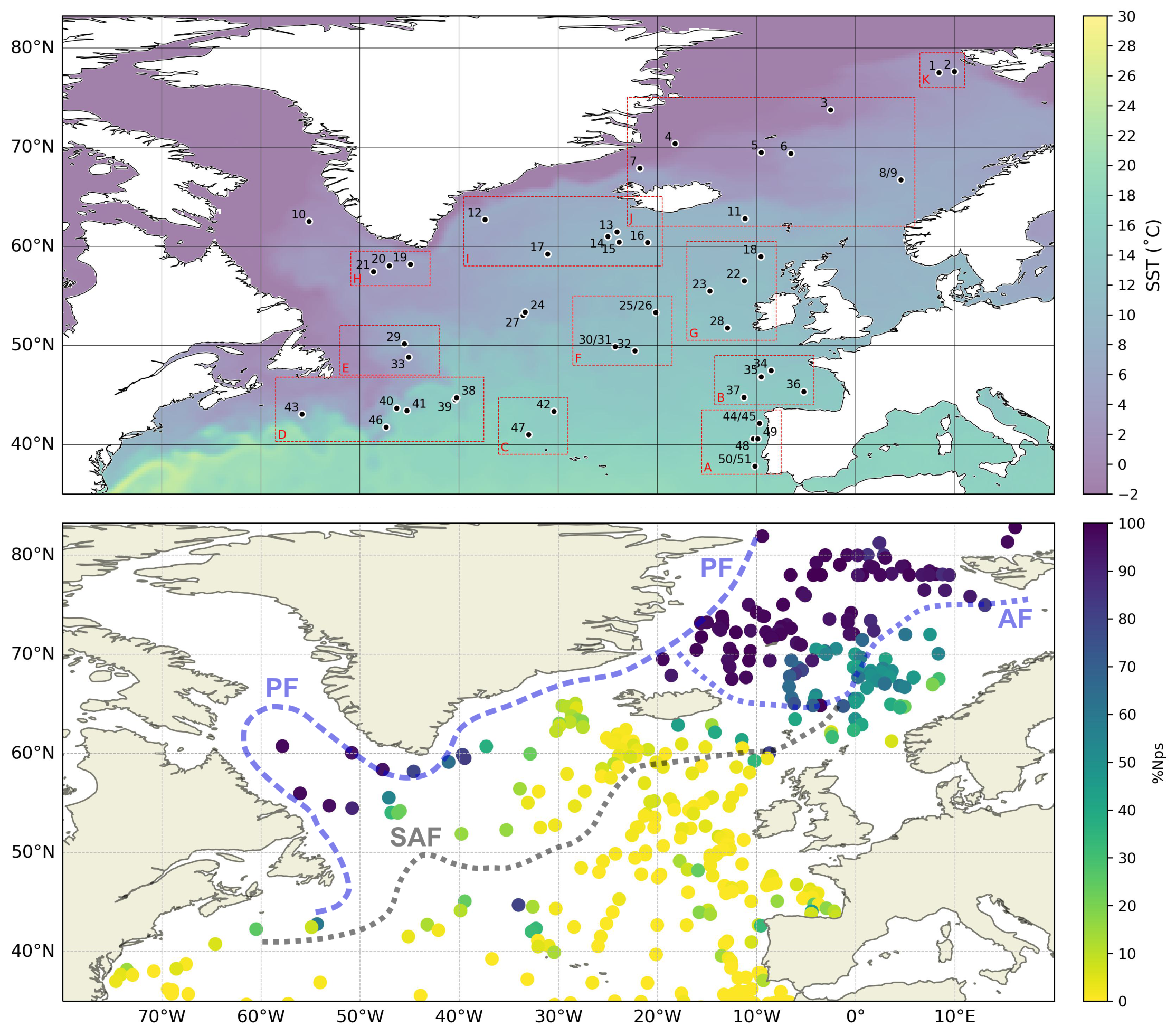
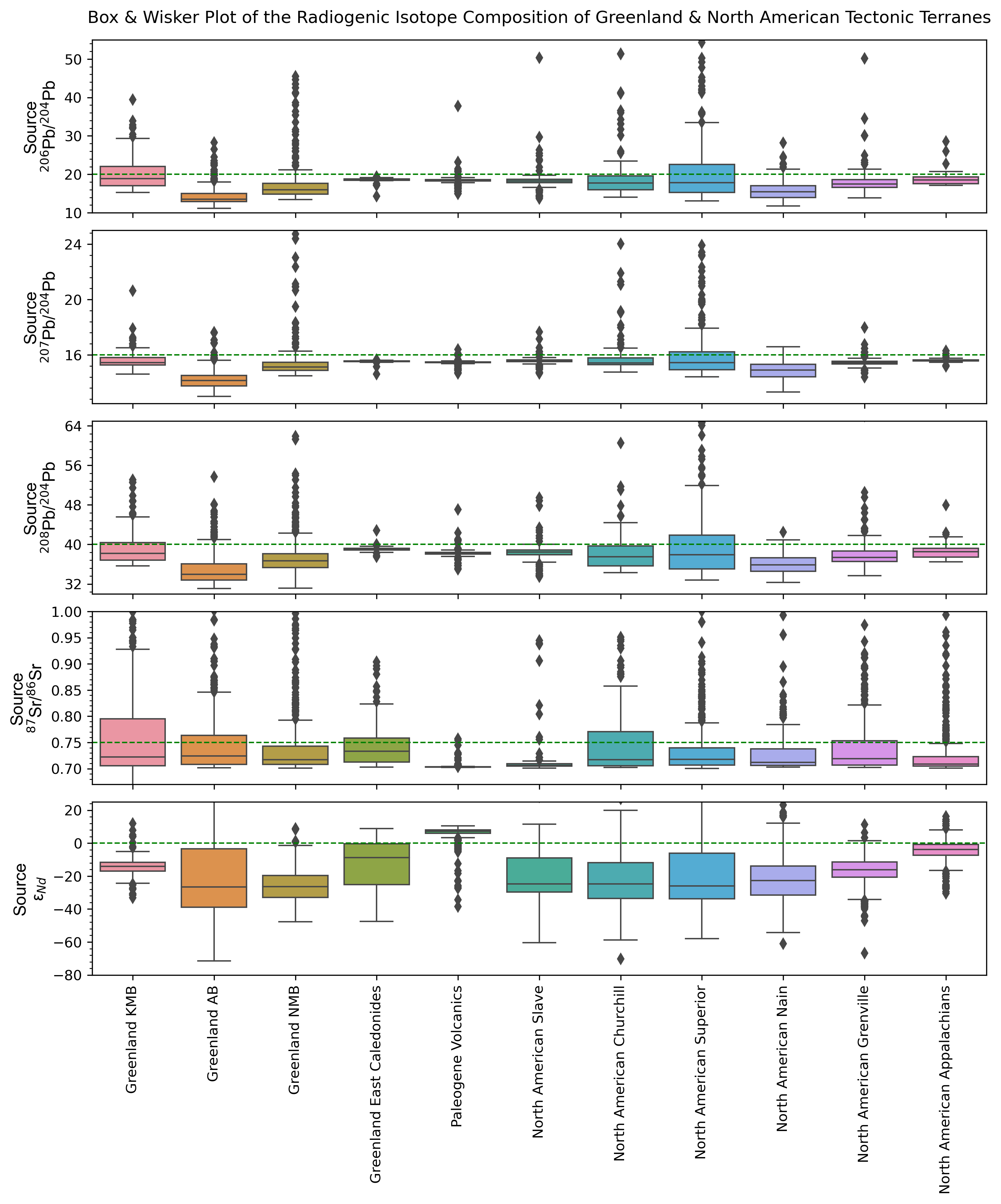
Examples of Graphics We Can Create for You